After over a decade in business, Zerocater has evolved into a fast-growing technology company helping businesses of all sizes build better workplaces through food. When Zerocater launched over a decade ago, the core idea of the brand identity started from an idea that catering should be effortless from our customer’s perspective. The idea of zero effort catering. The art of Origami was used to represent this idea, showcasing something very simple and beautiful on the surface while also involving an incredibly complex process that requires precision, patience and attention to detail.
Fast forward to today, and our business looks a lot different. Our products have evolved tremendously and we have the most customizable, flexible, and consistent cafeteria and catering solutions in the market today. All of these updates made it clear that our brand now needed to reflect this quick evolution.
We looked at 3 core drivers that the refresh needed to follow:
Realignment
Since the introduction of Cloud Cafe and Hybrid Cafe, Zerocater has grown as a company and expanded to include offerings such as Managed Catering (now called ‘Managed Cafe‘) and Event Catering (now called ‘Event Cafe‘), and our messaging, information architecture and visuals need to reflect this new shift in direction.
Simplicity
We strive for simplicity with everything we do. The technology and operations are very complex in nature, so our job is to make this as seamless and frictionless as possible for our clients. Our brand also needs to communicate this sophisticated simplicity.
Focus
Focus on the product benefits and the “what” vs. the “how.” We currently put a lot of emphasis on our technology (FoodIQ) and describing how our tech works. Going forward, we will be more focused on what our products do and their benefits to our customers.

To reflect this new reality while honoring our past, we’ve evolved our brand identity to support a more modern, simplified, and connected experience. The refreshed visual identity will include a new logo and wordmark while maintaining our original typography and color treatments. We also simplified the wordmark making all letters lowercase to make it more inclusive to our diverse community of customers.
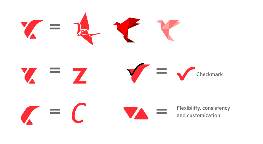

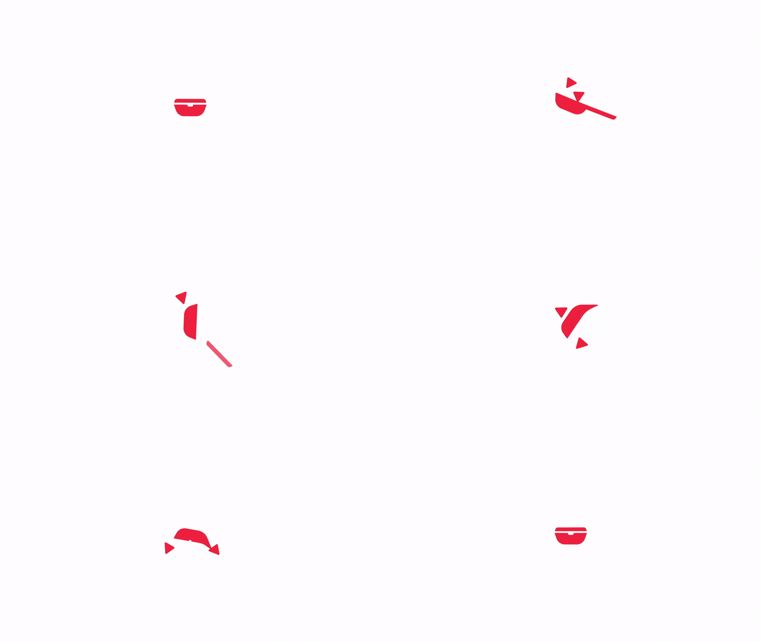
From the beginning of the brand refresh process, we knew we wanted to retain some of our original brand DNA. The origami crane/bird still needed to be our way of representing that original sense of effortless catering made simple for our customers. We love its original spirit and how beloved it is by our customers. However, we simplified it drastically, yet infused it with much more symbolism. We also wanted something that could stand the test of time, be simple enough that a 4-year-old could draw it, and at the same time powerful and flexible in its visual representation. The idea of flexibility and customization became very important in our evolution. The up/down arrows are a nod to our technology when we ask users to rate their meals so that we can smartly curate their next experience. We take these crucial elements and weave them throughout our visuals as you’ll see below.

We also wanted our products to take center stage. On the homepage, we show our customers how our products will help them simplify their food program from all aspects. It will also help users connect with our products directly. Along with the showcase of our powerful products, we have also updated some of our photography styles to reflect our position as the perfect solution for companies of any headcount. Our meals are customized to employee tastes, we have unmatched program flexibility and our operations are incredibly consistent because they are enabled by our powerful technology.


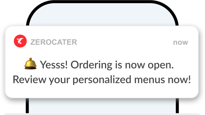
Over the next couple of months, we will be infusing this new brand refresh across all of our experiences. We’ll start with updating our corporate website which will have the new branding, color, and most importantly, information architecture and content. The go-live date for our website is today, 4/11/2022. We will also be updating the main branding such as the logo, some color, design elements, etc. on our app stores, email, and social channels.
Thank you to all of the amazing teams that provided us with the necessary content, tools, and overall contribution of ideas, feedback, and many rounds of quality assurance and testing.
We are excited for what’s next in this new chapter of Zerocater and can’t wait to share it with all our community of friends, supporters, and customers alike.
